Skip to Main Content

Data Visualization

This guide will walk you through what data visualization to use based on your research need and data type

Questions that can be answered by scatter-plots and bubble charts

Scatterplots can answer the following questions:

  • Does x correlate to y?
  • What are the outliers in my data?
  • What are the patterns in my data?

Bubble charts can answer the following questions:

x = x-axis variable, y = y-axis variable, and z = size of the bubble variable.

  • Does x correlate to y? Does x correlate to z? Does y correlate to z?
  • What are the outliers in my data?
  • Are there exceptions to correlations?
  • What are the patterns in my data?
  • What do the position, size, and color of an individual point mean for that data point?
  • How do multiple points compare to each other?
Steelberg, T. (2017). Data Presentation: Showcasing your data with charts and graphs. In K. Fontichiaro, J. A. Oehrli, & A. Lennex (Eds.), Creating Data Literate Students (pp. 165–192). Michigan Publishing.


Scatterplot

Definition of scatterplot:

A scatterplot displays the values of a dataset with two numeric variables. each data point is plotted on a grid, where the x-axis indicates one variable, and the y-axis indicates another variable. Oftentimes a line of best fit is drawn to show general trends in the data and the relationship between the variables. 

For additional information, check out https://www.data-to-viz.com/graph/scatter.html

Example of a scatterplots would be these hypothetical ones from https://datavizcatalogue.com/methods/scatterplot.html
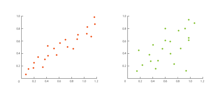
scatterplot

Steelberg, T. (2017). Data Presentation: Showcasing your data with charts and graphs. In K. Fontichiaro, J. A. Oehrli, & A. Lennex (Eds.), Creating Data Literate Students (pp. 165–192). Michigan Publishing.

Tips for scatterplots:

  • Correlation does not imply causation: just because correlation seems to exist between two variables does not mean that one causes the other. 
  • If your data points become too dense to read, consider making the points translucent, or using another type of graph. 
  • Scatterplots work best if there is some form of correlation between the two variables. If there is no to little correlation, converting the data to a scatterplot will convey little to no information to your audience. 
  • Look for clusters of points, points that follow a line, and points that are set apart from the rest. These three occurrences indicate important patterns such as frequency, correlation, and outliers. 
  • Label the fit line. 


Steelberg, T. (2017). Data Presentation: Showcasing your data with charts and graphs. In K. Fontichiaro, J. A. Oehrli, & A. Lennex (Eds.), Creating Data Literate Students (pp. 165–192). Michigan Publishing.

Bubble Chart

Definition of a bubble chart:

A bubble chart is similar to a scatterplot in the fact that two variables are mapped out along the x- and y- axis. What makes a bubble chart unique is that it adds a third variable by altering the size of the dots to indicate a numeric value. 

Here is an example of a bubble chart from https://visage.co/data-visualization-101-bubble-charts/

Screen Shot 2015-02-04 at 4.41.48 PM

Steelberg, T. (2017). Data Presentation: Showcasing your data with charts and graphs. In K. Fontichiaro, J. A. Oehrli, & A. Lennex (Eds.), Creating Data Literate Students (pp. 165–192). Michigan Publishing.

Tips for a bubble chart:

  • Bubble charts can get crowded because big bubbles can start to overlap: use datasets that don't have too many individual elements to ensure your audience can understand your data visualization. 
  • Label your bubbles, otherwise, your audience will not be able to understand what data elements the bubble refers to. 
  • Use a legend to indicate the meaning of color and size.
  • Bubble charts are best when the audience is comparing individual bubbles, but are difficult to use when determining trends or patterns in the data. 
  • Make sure to use the area of the bubble to indicate size instead of the diameter. 
  • Correlation does not imply causation. 


Steelberg, T. (2017). Data Presentation: Showcasing your data with charts and graphs. In K. Fontichiaro, J. A. Oehrli, & A. Lennex (Eds.), Creating Data Literate Students (pp. 165–192). Michigan Publishing.