Skip to Main Content

Data Visualization

This guide will walk you through what data visualization to use based on your research need and data type

Line Chart Definition

Definition:

A line chart is a collection of numeric data that is plotted with a connecting line on an x- and y-axis, where the x-axis most commonly indicates a time variable. 

Steelberg, T. (2017). Data Presentation: Showcasing your data with charts and graphs. In K. Fontichiaro, J. A. Oehrli, & A. Lennex (Eds.), Creating Data Literate Students (pp. 165–192). Michigan Publishing.

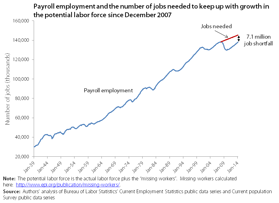
An example would be this chart from FactTank that looks at the number of jobs in the USA from 1939 to 2014:

gap excerise since 1939


Questions that can be answered by a line chart

Line charts can answer the following questions:

  • How does the variable evolve over time?
  • When was the variable at its highest or lowest?
  • Does the variable rise or fall in a seeming pattern?
Steelberg, T. (2017). Data Presentation: Showcasing your data with charts and graphs. In K. Fontichiaro, J. A. Oehrli, & A. Lennex (Eds.), Creating Data Literate Students (pp. 165–192). Michigan Publishing.

Tips for creating line charts

Tips:

  • Lines can dip below zero on the x-axis to display negative values.
  • You can indicate gap years in the data by breaking the line. 
  • Multiple lines, showcasing multiple variables, can be displayed on the same chart: use color or different types of lines (solid, dotted, dashed) to differentiate between variables. 
  • Do not use the double y-axis. It often obscures the data by confusing the reader. 
Steelberg, T. (2017). Data Presentation: Showcasing your data with charts and graphs. In K. Fontichiaro, J. A. Oehrli, & A. Lennex (Eds.), Creating Data Literate Students (pp. 165–192). Michigan Publishing.
Levitin, D. J. (2016). Weaponized Lies: How to think critically in the post-truth era (2nd ed.). Penguin Random House.

Tools for making line charts