Skip to Main Content

Data Visualization

This guide will walk you through what data visualization to use based on your research need and data type

Questions that can be answered by histograms and box plots

Histograms and box plots can answer the following questions:

  • What are the patterns in my data?
  • In what intervals do data points have the highest frequency [i.e., in what intervals are data points most concentrated]?
  • What is the distribution of my data? Does it skew a certain way?
  • What is the median of my dataset?
Steelberg, T. (2017). Data Presentation: Showcasing your data with charts and graphs. In K. Fontichiaro, J. A. Oehrli, & A. Lennex (Eds.), Creating Data Literate Students (pp. 165–192). Michigan Publishing.

Histogram

Definition of a Histogram:

A histogram is a graphical representation of the distribution of numeric data. It essentially looks like a bar chart, but instead of categories, it has "bins" that represent ranges of numbers. 

Here is a link to information about histograms: https://en.wikipedia.org/wiki/Histogram

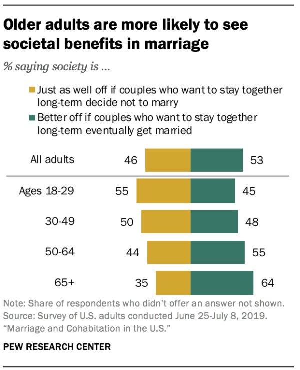
Here is an example of a histogram depicting the percentage of individuals who view cohabitation without marriage as problematic based on age. Image source : https://www.pewsocialtrends.org/2019/11/06/marriage-and-cohabitation-in-the-u-s/psdt_11-06-19_cohabitation-00-09/

Older adults are more likely to see societal benefits in marriage

Steelberg, T. (2017). Data Presentation: Showcasing your data with charts and graphs. In K. Fontichiaro, J. A. Oehrli, & A. Lennex (Eds.), Creating Data Literate Students (pp. 165–192). Michigan Publishing.

Tips for Histograms

  • Play around with your histogram's breakpoints - the interval size of the bins in which your data is placed: by changing the way you display your data, you can learn more about the distribution. 
  • Try to avoid having too many bins. Histograms generally do not have any space between the bins, so the more breakpoints you have, the more visually confusing the data becomes. 
  • Always label your axes. If possible, also label the range of your bins. 
Steelberg, T. (2017). Data Presentation: Showcasing your data with charts and graphs. In K. Fontichiaro, J. A. Oehrli, & A. Lennex (Eds.), Creating Data Literate Students (pp. 165–192). Michigan Publishing.

Box Plot

Definition of a box plot:

A box plot depicts numeric data through the use of their quartiles to show skews in the data. Below is a diagram explaining how to read a box plot. 

Box-and-Whisker Plot Explained

Source: Torban, A. (2018, October 16). Episode 34: How to Harness the Power & Beauty of a Box Plot - Featured Data Visualization by Eric William Lin. Retrieved from https://dataviztoday.com/shownotes/34.

Tips for Box Plots:

  • Multiple box plots can be mapped onto a single graph to show the distribution of several datasets at once and draw quick comparisons between them. 
  • There is an add-on for Google Sheets called "g(Math) for Sheets" that allows you to create box plots with ease. Unfortunately, you can only plot a single box plot onto the graph you create. 
Steelberg, T. (2017). Data Presentation: Showcasing your data with charts and graphs. In K. Fontichiaro, J. A. Oehrli, & A. Lennex (Eds.), Creating Data Literate Students (pp. 165–192). Michigan Publishing.