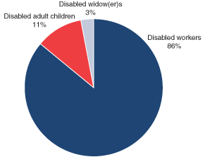
A pie chart is a circular graph that breaks different categories into sections (slices of the pie) based on percentage. Larger percentages result in larger areas for sections. Use a pie chart when you have 5 or fewer segments to compare.
An example would be this pie chart depicting all social security disability beneficiaries in December 2003. Data is dirived from the Social Security Office of Policy Annual Statistic Report 2003 https://www.ssa.gov/policy/docs/statcomps/di_asr/2003/charts.html#chart3

A waffle chart is a 10x10 grid in which each cell represents 1 percentage point, summing up to a total of 100%. It is used to show different categories that add up to a whole of a phenomenon, just like pie charts. Use a waffle chart when you are comparing more than 5 categories.
An example would be this entirely fictional waffle chart depicting Market Shares of Mobile OS in 2011 found here: https://www.pluralsight.com/guides/tableau-playbook-waffle-chart
