Skip to Main Content

Data Visualization

This guide will walk you through what data visualization to use based on your research need and data type

Questions answered by pie and waffle charts

Pie and waffle charts can answer the following questions:

  1. What percentage of the whole is each segment?
  2. What is the composition of the whole? What elements, combined, create the whole?
  3. How do the segments compare to each other?
Steelberg, T. (2017). Data Presentation: Showcasing your data with charts and graphs. In K. Fontichiaro, J. A. Oehrli, & A. Lennex (Eds.), Creating Data Literate Students (pp. 165–192). Michigan Publishing.

Pie charts

Definition of a Pie Chart:

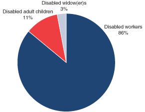
A pie chart is a circular graph that breaks different categories into sections (slices of the pie) based on percentage. Larger percentages result in larger areas for sections.  Use a pie chart when you have 5 or fewer segments to compare. 

An example would be this pie chart depicting all social security disability beneficiaries in December 2003. Data is dirived from the Social Security Office of Policy Annual Statistic Report 2003 https://www.ssa.gov/policy/docs/statcomps/di_asr/2003/charts.html#chart3

Pie chart described in previous paragraph.

A Complete Guide to Pie Charts. (n.d.). Retrieved December 12, 2019, from Chartio website: https://chartio.com/learn/charts/pie-chart-complete-guide/

Tips for Pie Charts:

  • Our eyes compare angles of pie chart segments instead of area, so it's hard to visually compare a pie chart with more than four segments. If you have a whole with more than three segments, consider an alternative data visualization like a bar chart. 
  • The total must add up to 100%. If you are trying to show responses to a survey question where respondents could pick multiple answers, resulting a total greater than 100%, then consider a bar chart instead. 
  • Additional Guidelines: this website provides additional tips regarding the design of pie charts. 
Steelberg, T. (2017). Data Presentation: Showcasing your data with charts and graphs. In K. Fontichiaro, J. A. Oehrli, & A. Lennex (Eds.), Creating Data Literate Students (pp. 165–192). Michigan Publishing.

Waffle Charts

Definition of a waffle chart:

A waffle chart is a 10x10 grid in which each cell represents 1 percentage point, summing up to a total of 100%. It is used to show different categories that add up to a whole of a phenomenon, just like pie charts. Use a waffle chart when you are comparing more than 5 categories. 

An example would be this entirely fictional  waffle chart depicting Market Shares of Mobile OS in 2011 found here: https://www.pluralsight.com/guides/tableau-playbook-waffle-chart

all-in-one waffle chart - final

Steelberg, T. (2017). Data Presentation: Showcasing your data with charts and graphs. In K. Fontichiaro, J. A. Oehrli, & A. Lennex (Eds.), Creating Data Literate Students (pp. 165–192). Michigan Publishing.


Tips for a Waffle Chart:

  • It becomes difficult to compare areas if there are line breaks in the data. In waffle charts, our eyes do actually compare area, so if the area is broken into two parts, it loses meaning. 
  • Label how much a square is worth in addition to listing a component's percentage.
  • Try to make the chart form a square or rectangle. When the chart does not form a square or rectangle, it becomes harder for our eyes to compare the general area. 
  • Waffles are not a default data visualization in Google Sheets or Excel. 


Steelberg, T. (2017). Data Presentation: Showcasing your data with charts and graphs. In K. Fontichiaro, J. A. Oehrli, & A. Lennex (Eds.), Creating Data Literate Students (pp. 165–192). Michigan Publishing.